When looking at how to design your website, think of design first. Customizing that design can always be done with web templates and components but first you want to be happy with the design.
Is it engaging, clear, concise, have a good amount of white space and focus?
Design Checklist….
- Is the design engaging to your site customer personas?
- Can you immediately spot the primary focus of your page?
- Can you find your company contact information easily?
- Does the design look just as good responsively?
- Are there options in your page design for swapping layout – so you might have a block of content that is a graphic – look to see if that section can be swapped with maybe text only.
- Are you giving your web team options in layout – as resources may change and your design ability may need to as well.
- Ensure you have enough white space in the design.
- Review with an extended audience
- Consistent fonts in the design – one H1, H2 and H3 formats, same font family – unless there is a specific reason like a quote in which you want to differentiate.
Once you have a design you are happy with you will work to slice up this design into what developers can take for components of the page.
If you have an analyst that is familiar with web design and CMS systems this is best as they will have the knowledge on the CMS system you use to give you advice as to which areas should be fixed in the page and which can be droppable or customized to be shown various places in your page.
Two items that should be fixed are the header and footer of your site, so those are fixed areas. The space between them is the customizable section.
Below is a sample I have put together on options you need to write in to requirements for the development team:
Component Options:
- Is this block fixed or repeatable?
- Where can a user drop this block in the page: Anywhere or only in a set up container?
- Padding options around components – Ensure the padding around this block can give options on to show padding or hide padding depending on where in the page a user drops it. (Example if you have a hero banner image that for some reason you want to reuse in your page, you don’t want padding to show above it, between the site header and navigation and page, but further down the page you want to allow for padding between this image and possible text above it.)
After you think about the component/block options, then you think about the content in them and provide rules for the text, images, links, link text etc to show in them.
If you have component – section usually row of the page that has text and an image, you could come up with options below as requirements for the component design flexibility.
- Ability to show image in left or right side
- Ability to change background colors and text from either white background, gray background or black background in text box – thus also changing the font colors so text shows appropriately.
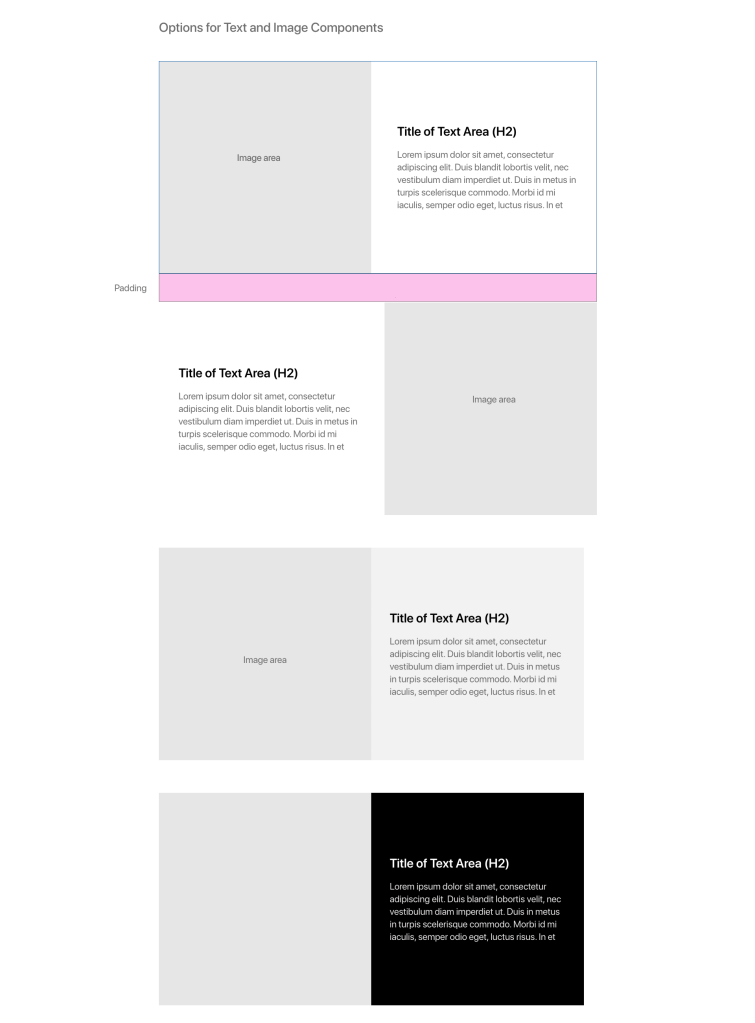
Above shows options that you can use with your design flexibility requirements.
Component Authoring Requirements:
In the components you also need to think about the authoring requirements. Will a user be able to link the text, select items from a drop down to show or customize anything in these fields?
Options for author-able text:
- Ability to add a link – URL, Text for URL, Open window selector
- Ability to customize text – bullets, bold etc.
- Text areas are friendly to HTML – ability for HTML to be read in these boxes – in the case you have to add a special character that the Copy Editors may ask for like a copyright symbol or Em-dash.
I’ll be adding more to my suggestions as we go and also include a full sample requirements document for a page – with focus on AEM Experience manager as the CMS of choice.
 Web Content Management